Sorry this is late.
1. Consistency of design: Very consistent. You kept the blue line at the top on every page. There was a simple color scheme throughout (grey/navy blue). There were 5 buttons that never changed- this made it easy to navigate.
2. Color and design: simple but easy to follow. I did not feel distracted as I do on many sites. It was easy to find your work and enjoy your pictures. You stuck with grey for text- this made it easy to read
3. Use of imagery: Limited. A couple times you used your own picture to fill an empty space. This made the site feel fuller but also felt a bit random. For instance the triple image of your dog confused me just because I was unsure of what it related to.
4. Use of line/color/text: You kept this plain. There was the one line at the top of every page that held the site together. Other then that there was little extra "decoration." Sometimes you used your own picture to fill and empty space on a page. Although they did look nice I didn't see the connection between the image and the content of the page
5. Desc. of projects: the description of the 2nd and third project fell a little short. The only description was the words that were already part of the project. I would have liked to read some of the things you told the class while presenting (especially for the home project.)
6. Bio: Complete and informative but not too personal. I liked how you included your education and exhibited works of art. It was a well organized page.
Overall I really enjoyed viewing you site and images (I might even check back to see if there is something new). Way too go! Hope you have a nice summer.
Monday, May 12, 2008
Review of Jaqueline's Site
A day or two late, but hopefully not a dollar short. My apologies.
Jaqueline's website was fairly straightforward, boasting a menu at the top which provides links to all three of her projects. The first two projects are navigated by simply clicking along to view the work, and all links were in working order. The video project was also hosted on the site, and was able to be viewed by an embedded quicktime player. Her bio contained a photo of herself, along with contact information and a little 'about me' section. The entire webstite as a whole was incredibly effective and really highlighted her work!
Kudos Jaqueline!
Sunday, May 11, 2008
Review of Sean's website
The header portion of each page contains links to the home, projects, bio and contact pages, and remains consistent from page to page. This keeps all the essential links in one place, making navigation easy and intuitive. Design is consistent and very simple, utilizing a standard black on white color scheme, and sans serif fonts. All of the imagery on the site is well organized and relevant to the content. There is a thumbnail in the header that is different at each page visited, as well as previews for each project on the "projects" page, a more in-depth preview of the "Fear and Loathing in Asbury Park" project on the homepage, and a nice postcard graphic on the contact page. The images from each project are organized into separate flash galleries that are accessed from the projects page. This works well and is an appropriate way to view the work, although there is no space left for descriptions of the individual images. In fact, my only problem with the site is that the description for project two is on the homepage, which is somewhat confusing and separates it from the rest of the project. The description itself, however, is interesting and well written, providing a historical background on the area, a description of the town's current state, and a poem. The bio page is very sparse, with only two sentences and an accompanying photo, but I think that this works well, complimenting the minimalist aesthetic of the rest of the website, something that is also reflected in much of Sean's work.
Saturday, May 10, 2008
Website Review
I am supposed to view Allie's site but can't seem to see any page besides the home page. So, I randomly selected to review Mike's website since I will be out of town for the rest of the weekend.
1. Consistancy of design from page to page works well. The navigation bar on the left is very consistent which helps the view to navigate through the pages. The concept of the contact sheets helps the viewer understand that it is a photography website.
2. The navigation throughout the pages works well. The scroll on the right is a little distracting because you actually have to use it to view the whole picture (at least on my computer) and it takes away from the images.
3. Use of imagery: I like the choice of imagery and using his own pictures as the thumbnails for each page, I think that works well and entices the viewers.
4. The use of color is nice. The black background works with the images. The text might be too large, I would maybe make it a size or to smaller. It tends to be too distracting with the page.
5. I really enjoy the setup of the pages, the introduction to the project, then hitting enter, and then seeing the pictures.
6. I like his bio page. It does not look last minute and explains just enough information about him.
Thursday, May 8, 2008
Jeff's website critique
1. Consistency of design: Layout is consistent, except last project Home goes over navigation words on left side.
2. Color and design: I feel the black background and simplicity of site works with your images. Your logo is great, the letters JF & the layout you have works very well together, very professional looking logo.
3. Use of imagery: Thumbnail images when clicked led me to the blue “windows internet explorer viewer” with their nav. bar. I don’t know if that’s how it looks on all computers or just my window’s environment at home but that does not look/work well.
4. Use of line/color/text: Easy to read text and nice color choices, simple layout. I personally am not a fan of very busy sites especially for this type of Artist website. I did find it hard to see the dark grey against black words on the left side; you might want a little more contrast for ease of viewing on different monitors.
5. Desc. of projects: Is not there yet.
6. Bio: Is not there yet.
You did give me a heads up about it being a work in progress, so far looks like your going in the right direction with the layout and design. I would have liked to see your bio and where you are heading in life…lots of luck in the future…Nancy
Wednesday, May 7, 2008
Review of Amber's Site
1. Consistancy of design from page to page - Color and theme are consistent but the page changes size from page to page.
2. Ease of navigation: Navigation is simple and easy. All pages are accessible as you move through the site.
3. Use of imagery: I really love the logo/key rollover link! I also like that you added a quote to accompany it. The website doesn't incorporate any other imagery but I think it works. Otherwise, it might be overwhelming and erroneous.
4. Use of line/color/ text: The black, white and blue is really simple yet elegant and the blue goes along with your first project which I thought was nice. The black border is a nice frame too.
5. Text that explains each project. The text is clear and proper English. I wish you had included the significance of the blue eyes in the text for your first project and how your dad had blue eyes as well.
6. Discuss Bio- Went beyond the basics; included how her perspective of documentary photography as changed. I don't think it was last minute. I also like that is the first thing we read when entering the site-- it gives the viewer your background before looking at your pictures.
Overall: I thought your website was really well done and looks very complete!
My site URL:
http://www.tcnj.edu/~farinar2/index.html
it is not the essence of perfection, it is in a means of development to always be updated and improved. I'm pretty sure everything works, but things may be blacked out because there's no link yet, etc.
http://www.tcnj.edu/~farinar2/index.html
it is not the essence of perfection, it is in a means of development to always be updated and improved. I'm pretty sure everything works, but things may be blacked out because there's no link yet, etc.
1. Consistancy of design from page to page -
The page design is the same every time you click on one of the series. First, it brings you to a description, then a link and finally, large-scale photos of the series.
2. Color and Design - The color of the text varied from link to link - it might have been more cohesive if you had stuck to one or two colors. The main index page of the site is interesting, but a bit hard to figure out because I didnt see any names that indicated what each of the links brought you to...the photos didnt seem like links. I liked the film strip border idea though - it was a good way to tie in the header and the series posted on the left side.
3. Use of Imagery: The images seem to be organized well. Each one is set up the same way. Thus, there is consistency within the whole website's construction.
4. Use of line/color/ text - As stated previously, it would have been good to stick to one or two colors and used them throughout the whole website. Also, it would have been interesting to see a simple, but different font other than times new roman. The index page is clean, concise and neat to look at.
5. Descriptions of Projects: Some were more clear than others. Series One's description was a bit too simple. I would have liked to know why the project was called 'evil' or the thinking behind its construction. Series Two's description worked well with the coinciding pictures. The same for Series Three.
6. The bio seemed to be well though out. In the future, it might be cool to include links or additional information related to your creative processes.
Overall, nice job!
Tuesday, May 6, 2008
JEFF!
JEFFJEFFJEFFJEFF
heyyy, please view my site in safari, or at least any browser other than firefox. for some reason my fonts and image order don't translate in firefox =) thanks!
-Dena
heyyy, please view my site in safari, or at least any browser other than firefox. for some reason my fonts and image order don't translate in firefox =) thanks!
-Dena
WEBSITE REVIEWS
If you're website is not posted - immediately post it ON THIS BLOG!!!
Reviews due: Saturday, 11
Criteria for review of websites:
1. Consistancy of design from page to page - do menu items move? Does color and design
remain same from site to site?
2. Ease of navigation: confused? simple? elegant? frustrating?
3. Use of imagery: organized? Distinctive? Clever? How?
4. Use of line/color/ text
5. Text that explains each project. IS it clear? Is it repetitive? Is is proper english?
6. Discuss Bio- effective or obviously last minute design/content?
---------------------------------------------------------
Mike review Artur's site:
Nancy, please review Jeff's site:
Amanda: review Nancy's site: http://www.tcnj.edu/~oreilly4/Index.html
Allie review Amber's site http://www.tcnj.edu/~cortina3/
Sean, review Jacqueline's site: www.tcnj.edu/~laven3
Addie, review Mikey's site: www.tcnj.edu/~smith279
Jeff: review Dena's site: www.tcnj.edu/~lagomar2
Mikey: review Ross' site: http://www.tcnj.edu/~heutmak2
Dena: review Amanda's site
Amber review Allie's site
Alex review: (your choice, must add additional information than waht's listed above)
Jacqueline; review Alex's site:
Ross review Sean's site:
Artur: please write review for Addie's site:
www.tcnj.edu/~stuber2/Web%20Final
Tuesday, April 29, 2008
final exam class
please sign up for food/drinks you'll bring to final critique on the class blog--- just go to this entrty pn the blog and hit comment!!!!
Amber taco dip..and bringing chips for it.
Amanda______
Allie cups and plates if we need
Addie _______
Jeff________
Ross _______
Sean________
Artur ________
Dena donuts
Nancy Cookies.
Mikey few bags of chips.... does anyone want anything specific? Yes!!! Pretzels????
Alex_________
Jak : soda/tea!
Amber taco dip..and bringing chips for it.
Amanda______
Allie cups and plates if we need
Addie _______
Jeff________
Ross _______
Sean________
Artur ________
Dena donuts
Nancy Cookies.
Mikey few bags of chips.... does anyone want anything specific? Yes!!! Pretzels????
Alex_________
Jak : soda/tea!
Monday, April 28, 2008
Political Response
Just realized that I never put this on the blog!
Although my family was not to interested in many political events, there are a few that I remember like they were yesterday.
September 11th..
I clearly remember sitting in art class where we listened to the radio, and being one of the first students to here the devastating news. Minutes later, the principle came over the intercom and explained what had happened. Then, we went into the gymnasium and watched the news and events on television. It was a horrible experience ad something that I will remember forever. Not even knowing anyone who was in New York that day, I could feel nothing but sadness towards the victims and our country.
The OJ Simpson Trial..
Being a huge football fan, I was always interested in things that surrounded players lives. This trial happened when I was pretty young, but I still remember being glued to the television with my mother yelling at me to turn it off. She was so angry because she truly believed and still believes that he is guilty and said I was wasting my time by watching it. In my own opinion, I still think he is guilty and cannot believe that he was set free.
When I was younger, political events did not seem as important to me as they do now but I realize that they did have an impact on my opinions, decisions, and ideas of the world as it is today.
Political Events and My Lifee
Neither of my parents have adamant political agendas, and so politics have never played a huge part in my life. As I have come to know something about them from friends and high school/college, I've just strengthened my belief that our government is incredibly corrupt, and I want no part in it. However, there have been a few events that have affected me, as well as contributed to this belief.
1995- 6 years old- the O.J. Simpson Trial. This case was the first time I was introduced to how corrupt our government and judicial systems are, as well as the materialism of the majority of Americans. I knew OJ was a bad man who killed his ex-wife and her boyfriend, because I knew he had special Italian shoes (a fact I announced proudly, being 100% Italian.) When he was found not guilty, I was so angry, and I knew it was because he had a lot of money, being famous. This made me very angry and disgusted at my country.
2001- 12 years old- September 11th. I was sitting in English class when my teacher was called out of the classroom. She came back in holding back tears, and told us all that the Twin Towers had been hit. I live about 20 minutes from the city, and as I walked through the halls, kids whose parents worked there were clustered together calling to see if they were okay. Quite a number of students lost parents that day, and I for every anniversary since, it's always such a fragile time in school, and everyone gathers for those students. I got picked up early that day, and my mom was so scared that we weren't safe- my family all just held each other on our couch watching tv.
Political Response
super late, i know
O.J. Simpson
1995: 6 years old
This is the first thing I remember that has to do with anything political... but all I remember is that O.J. became a bit of a punchline about getting away with something. It didn't affect me otherwise.
Columbine H.S.
1999: 10 years old
I remember this really distinctly. My parents were freaked out and I didn't really get it, but I still knew it was important and scary. The next time I was doodling, i decided to draw something related to Columbine, and I drew this picture of my brother's hat, with a bullet hole, on a table, blood dripping down to the floor where a gun layed. If I had any abilities, it would have been a pretty scary picture, but it looks like hell.
Bush's first election
2000: 11 years old
This was a pretty big deal to me... I was very much for Bush, and very much against anything that was involved with Clinton (thanks to my parents' distaste). My school did the whole mock vote thing also, and I remember being a smug little bastard when he had officially won, because my class was probably about 85% for Gore. More than feeling like I won, I felt that I was "right", and it was nice to be "smarter" than the other kids who picked the "wrong" candidate. Looking back, I think I was really just choosing who I thought would win, so that I could look smart.
9/11
2001: 12 years old
My mom came and picked me up first. I was more freaked out about it at the time because my mom was too scared to understand me when I asked if my dad was working there, because he used to get around a good amount for work. We picked up my 2 brothers, and our neighbors (one guy and one girl). We drove home, and all of the guys thought it was great; a day off of school! We went home and played Battleship as out of the corner of our eye the buildings were going down. I saw it all happen, and if I really wanted I could have seen the building's smoke from my town. My mom told me years later that she was convinced we were going to die that day.
War on Terror/Iraq
2001-present: 12-present
It has been me against everyone I know when it comes to this war. I feel that this is the kind of thing that should have happened. If you'd like to hear more, just ask, but I've had this argument too many times to think that I can fit it into one blog post.
2008 Presidential Election
2008: will be 19
This is my first election, and I'm very excited to vote in it. I feel like I have some small degree of power and I'm really pumped up to contribute to the candidate I decide to vote for. I'm undecided right now though.
Wednesday, April 23, 2008
reminder: Exam meeting 5/5/2008 7:30 pm - 10:20 PM in HH374A
Hi All,
Your final project 3 will be due during our exam week meeting and not next Monday. You need to have a final version of your mock-up or rough to show me Monday.
ALSO:
please sign up for food/drinks you'll bring to final critique:
Amber _______
Amanda______
Allie _______
Addie _______
Jeff________
Ross _______
Sean________
Artur ________
Dena ________
Nancy _______
Mikey _______
Alex_________
Jak __________
Monday, April 14, 2008
Project Three: Home
The fundamental difference between a house and a home is the source of comfort a house provides. While brainstorming for project three, I asked many of my friends and family about one object/thing/idea they could not leave the house without. Many said their phones, wallets, ipods. I then specified my question to: if you were moving away from the house you grew up in, what would you take to remind you of home? Many responded in a manner that shows that this is something they have thought about before because many are in their first year of school and had to go through the process of moving not too long ago. One of my friends said they could not leave their house without an escape plan, another said her favorite Cat Stevens album and my sister said her family. Another asked if it was possible to bring a smell. For me, I could never move away without Moby Dick. Many of the responses I received translated into a person's prized possesion, their source of comfort and their source of security. It makes me wonder how objects can have so much power over an individual, the epitome of this being a house. Without a house, you don't have much. America places so much emphasis on "stuff" and housing your "stuff." Without emotional attachments, one's possessions would basically mean nothing. In my series, I would like to attempt to capture the intimacy of a person and their "object." Because a Cat Stevens album may not mean much to anyone else, but to someone, it can mean home.
Sunday, April 13, 2008
My Life and Political Events
I believe that political events: Have influenced my life to some degree.
Year: 1973
Age: not born
Event: Yom Kippur War
Effect: My dad basically dodged joining the Israeli army and came back to America for college. I added this because the major political influence in my life is my father. He has described this time in his life to me in much detail. If he did not choose to move back to America my entire life… well, may not have been a life.
Year: 1998
Age: 9
Event: Clinton sex scandal- The president “kissed” a woman that was not his wife. He denied it even though everyone knew it was true. President Clinton was a good politician but “couldn’t keep his pick in his pants”
Effect: I became aware of the media and its relationship to politics. I learned that if you have something politically related to say adults will actually listen to you.
Year: 2000
Age: 11
Event: Bush beat Gore- I was in school and we were having mock elections. We spent a couple weeks split into two sides debating and researching our chosen candidates. The class became very competitive and I personally was very upset at one specific girl (Kristen) who was a Bush supporter. I am not sure why, but I have a clear memory of getting into a heated argument about our candidates and feeling that neither of us had any clue why we chose our guy. The teacher had to intervene because we were both becoming angry.
Effect: Eventually Gore lost, in the real election that is, and I felt embarrassed. I learned from this experience that politics felt a lot like sporting events. Everyone chooses a team; if you win you are cocky and if you loose you are ashamed and frustrated.
Year: 2001
Age: 12
Event: Sept. 11- I was in class with my favorite teacher. He calmed everyone down and broke the news. We went outside and listened to the reports on his car radio. My class spread rumors around the entire school, even to teachers, that the twin towers were hit by mistake but they crumbled to the ground. A few kids were hysterical because their parents worked in the buildings. I was upset because other students were crying but could not visualize what really happened. I got home and watched the video on the news and broke down. My two younger siblings and I had a sleepover in my parent’s room for the next couple days because we were afraid.
Effect: I learned that America is hated.
Project 3- Home
For project three I will explore home as a casing. I have decided to photograph a group of things that people live inside... bed, clothing, car, house and skin. I want to include two groups in my series. One will contain things that are new and fresh looking. The opposing group will be of things that are old and decrepit.
My goal is to create an assumption in the viewer when they look at the images as a whole. Each image, of something that acts as a shell, will not show what is inside. I am trying to create a commentary on modern values in America.
Most of our country has the financial ability to make choices about what color mulch to use in their front lawn, what molding to use around their windows and which shoes wear with their dark jeans (the list goes on). In many other places life is lived to survive and not to create any specific lifestyle or image.
The content of each casing becomes secondary to the exterior. I wonder if this mentality carries over into other aspects of our life, such as, presidential candidates. Is the image of a politician more valued then there policies and principles?
Home is the ultimate casing, the ultimate exterior. So much goes on inside a house that is never seen, but, your neighbors always think they know you
Political Awareness/Home: Behind Closed Doors-Jacqueline
In 1988, I was 8 years old.
I remember the presidential election, but not much about it. We talked about it in school. I remember that Bush was elected, and I did not like him very much. I don't remember where those feelilngs came from , but I remember not liking him. My immediate family isn’t very political, so I don't think it really effected me, personally.
In 1991, I was 11. Operation desert storm began. I remember the news coverage and the yellow ribbons, learning about POW/MIA and how important it is to support our troops.
It affected my cousins and my uncle/aunt. He is a lieutenant colonel for the army and he was over there at the time. My mom was worried about him, but I guess I was too young to get involved.
In 1996, I was 16. Clinton was elected as president and most people around me were pretty satisfied with him. It had no real effect.
In January, 1998, I was 17 years old. I remember the exacerbation of the Monica Lewinsky scandal. It was covered almost 24/7 on the news and in the newspapers. It made me realize how incredibly drama-hungry our country is, and how manipulative our media is. It also made me wonder why it was more important than real political issues that deserve more attention. It did not make me hate him as a president.
On 9/11/2001, I was almost 21 years old. I remember my neighbor waking me up to tell me that I should go and pick my little brother up from school because we were being bombed. I turned on the television to see what was really happening and I was in shock. I went to get my little brother, because it wasn’t clear exactly what was going to happen next. All of the parents were there, getting their children. Everyone was panicked. It was very surreal.
I think that this event heightened everyone’s political awareness. It was a wake-up call for everyone. Our country is not invincible. I was more aware every time that I traveled, almost fearful. It changed a lot for me. I made sure to vote in every election following 9/11. The impact on our country because of this so-called, “War on Terror” is tremendous. Our economy is crashing, my husband is having a hard time finding a job in his field, and I am afraid that I will have the same problems.
My Life and Political Events
I believe that political events: have influenced my life to some degree
Home to me, is the people in your life. Even if there were no structure to dwell in, home would still be the people whose live's you inhabit and vice versa.
For this project, I have several ideas. One is an obvious relationship to home: the people who inhabit my life.
My other idea is this: I went to Greenwich Village in NY, recently. There were so many sex shops...5 in less than a 1/2 of a block. This made me wonder what it would be like to explore home as a private space, and to expose some of the things that go on behind closed doors. I am not sure that I would be able to find that many people willing to let me photograph them, but I know enough to let me photograph their things. This is definitely something that I would like to experiment with.
I have had several other fleeting ideas that have not really been as feesible as I would have liked, so I am moving on from them.
I know through experience with our last project that things don't always take shape like you want them to. I know that I may have to experiment with several different things before I get it right. So, I guess I will see exactly where it takes me soon.
Home.
Overall, I feel that political events have had only a small impact on my life. While I have, from quite a young age, been aware of the political universe, and even taken an interest in it, I have never felt any direct effects of it in my own life. In 2001, I noticed no discernible change resultant of the switch from Clinton's democratic presidency to Bush's republican one. I took quite an interest in Clinton's sex scandal, but again, its outcome was of no personal significance to me. Even the war in Iraq, which I oppose for various reasons, has not had any actual effect on me or my lifestyle. If I did not watch television or read the newspaper, it is likely that I would not even realize that the country was at war. This is not to say that I don't care about politics, but that my lifestyle is such that I am not immediately affected by it. I do not own a home, I only work part time, and I do not have to worry about taxes or social security. Of course, this will all change within the coming years, but up to this point in my life, politics has played an astonishingly small role in my life.
Two political issues, both related directly to the concept of "home," in which I have recently taken interest, are the Tibetan Sovereignty debate and the issue of morality in The Church of Scientology, specifically its "disconnection" policy. Unfortunately, I do not anticipate traveling to Tibet any time soon, so this issue is not a likely candidate for my project. The issue of Scientology is, however, much closer to home. The church, which is known for charging its members large sums of money in order to allow them to advance within the religion, has a particular policy called "disconnection," which requires members to sever all contact with non-members of the church, including immediate family members, in order to move beyond a certain rank. On Saturday, I attended a protest organized by the internet organization known as "Anonymous," that specifically targeted this disconnection policy. I took still photos, as well as video, and I plan to supplement this with further documentation supporting both sides of the argument. The end result will be a video incorporating both live action and still images.
If for any reason the above project does not work out, I have already begun work on a book, to be printed by Blurb, dealing with the experience of growing up in New Jersey, a state that is often misrepresented and misunderstood. I had considered this more of a long term project, but it does fall comfortably within the concept of "Home," so it is a possible candidate for project 3.
Saturday, April 12, 2008
Home is who you love
Political Event-
I believe that one of the main political events that changed the course of my life was the Vietnam War. When I was nine years old my two brothers had to pick a number in the draft. My oldest brother, Ward, picked a high number and went off to college and never served in the armed forces. My other brother Bobby picked a low number, was drafted, and started receiving letters to register with the Army. He was devastated, my brother Ward loved to hunt, and Bobby fed the deer and birds and brought home stray and injured animals. This was the early 70s and he also experimented with drugs. He was peace, love and Woodstock. He died a tragic death before he could ever go into the army.
This dramatically changed my family and how I viewed life. I believe that the course of these events made it clear to me that family and who you love is what's most important, and that it is the people not the place that make the home. I knew once I became pregnant with my first child my career in the financial corporate world would end and my emerging family would come first. After 13 years of having the privilege to stay home to raise our children I made the decision to go back to school to get certification as an art teacher and continue to be a hands-on parent as my children enter middle school. This will allow me to go back to work and have the same schedule as my children; which my husband and I feel is vital in our ever changing world.
My husband and I have been together for 28 years, married for 18 and have had two children together. There is no question in my mind what home is. Home is who you love.
Monday, April 7, 2008
Home Proposal
The association one makes about the word Home can have almost endless possibilities. Home can mean people and love to some and possessions to others or a combination of all. It could also take a different approach and explore a more spiritual meaning of the word Home.
A place of worship can be a place of comfort, refuge, peace and love for many; those are all words I would use to describe Home. Further associations with places of worship are birth, baptism, involvement, community and a final resting spot. I feel this series could take many different avenues one involving the spiritual feeling of the structure, its members and their association to religion and God. Another focus could be on the actual structure or items inside and out; the baptismal water, stained glass windows, the pews and alter. Some people feel that when they finally get the end of their life they are going home, home to see loved ones that have left before them, home to meet their God or their Creator. The pictures could be arranged in an almost chronological order, birth to death, giving attention to be respectful of the subject matter.
Another route I would prefer to explore would be that Home is the people in your life. (This is contingent upon being able to borrow the light kit several times) If I can make the arrangements to borrow the light kit from school I would like to take portraits of those in my life that make up my home. To me personally Home is not a place, the place is unimportant, it’s the people and a feeling of love where ever you are. That is Home to me. Experiment with portraits that would somehow show he essence of he person. I would like to explore indoor lighting. Use of different backdrops High Key with white and Low Key with black can also be explored. -NJO
Project 3 ideas
Project Idea 1:
The original idea that I created came from a conversation with a friend of mine. Sherif is a 30-something man who immigrated to the United States nine years ago. The last time I talked to him, he told me about how he wanted to better his English speaking abilities, and how he has no time to do that because of his hectic work schedule. “This is my home,” said Sherif, as he turned and presented the gas station, notably his little heated box. During the night, when most people are sleeping, Sherif works the night shift at a gas station, and works approximately 60 hours a week. Thus, the concept of work as home was developed, and the project idea of documenting this man’s home was developed.
The project for work as home would be in a style that doesn’t fall in line with place or person, but more as a place where one mentally lives. The pictures would include portraits and landscapes, as well as more abstract uses of light and movement. As the hours for photographing would fall between dusk and dawn, possibilities involving the passing of time are available. In addition, establishing shots from the other side of the highway, or even from the middle of the highway are a possibility. One of the positive assets of this project is availability, because, excluding the rare visit from someone getting gas or Dunkin Donuts (where Sherif formerly worked the 12 hour night shift 5 days a week), it would only be Sherif and me at this location.
Project Idea 2:
The second project idea is a more involved one. Instead of photographing a metaphorical home, this would be a literal home. However, this is not a home that one inhabits. This is “The Home I Do Not Have”, which is a humorous look into places (mainly IKEA) for the interior furnishings that my house will have when I buy one later in life. The final project, tentatively, will be a sort of Barbie dollhouse that will incorporate mixed media, focusing mainly on my photography, IKEA’s advertising photography, and potentially the use of a preexisting dollhouse to “build” my house. Otherwise, it would be presented as if it was my house, without the usage of a dollhouse.
Potential ideas that have crossed my mind for this project have been often very different, but I feel that some of them have valuable potential. Perhaps I could take pictures of myself at all stages of a house; at the IKEA store, I can be sleeping on a bed, cooking in a kitchen, using the bathroom, etc., and then use those pictures over pictures of my current home to show the desired result. In addition, the concept of using all of these pictures as one, thus showing more than one of myself in any given room, is definitely an idea I will use if I go through with this project.
mikey smith
Project3, Home
For my final project of Home, I am trying to decide on two different ideas. The first idea is to photograph all of the school’s that I have ever attended. School is an important part of everyone’s life and we spend about 20 years in it. School is where we meet people, make friends that we may still have, learn and make plans for our future. When I think of home, I think about my friends who mean the world to me, and a home that I will one day work for and create. I would have never known any of my friends if it was not for school and would have no future either. I have attended six schools in my lifetime and would like to have an outside and an inside shot of all six to create twelve images.
The other idea that I have is more literal, shooting in
Sunday, April 6, 2008
Project Three - Home
For my final series on Home, I would like to explore a piece of my life that I have always associated home with: Food. Whenever I am at school, forced to feast on meals made from cans, freezers, boxes and microwavable bags, what makes me yearn for home is memories of my mom's cooking. There is something inherently personal about food that is made from scratch. Dishes cease to be just about relieving hunger. Instead, they start to be the meals we turn to whenever we are in need of comfort, nostalgia or happiness. Beyond the obvious, there are so many examples of what food does for people. If food wasn't such a multi-faceted thing, there wouldn't be so many conditions that revolved around it - emotional eating, binge eating, dieting, eating disorders....
I hope to explore how food relates back to my sense of home. I want to photograph the food in a way that hasn't necessarily been done before. I feel like food photography is something that has become a bit cliche, due to a multitude of food magazines and cook books. Thus, I want to try to explore newer, more novel was of capturing it, while still maintaining a sense of 'home.'
I hope to explore how food relates back to my sense of home. I want to photograph the food in a way that hasn't necessarily been done before. I feel like food photography is something that has become a bit cliche, due to a multitude of food magazines and cook books. Thus, I want to try to explore newer, more novel was of capturing it, while still maintaining a sense of 'home.'
Monday, March 31, 2008
Brian Ulrich Video Link
Here is Brian Ulrich's Video Link....
http://www.brightcove.tv/title.jsp?title=1252317341
http://www.brightcove.tv/title.jsp?title=1252317341
Monday, March 24, 2008
Martha Rosler Response
"Imperialism breeds an imperialist sensibility in all phases of cultural life."
Interesting and relative link about Martha Rosler... http://www.vdb.org/smackn.acgi$artistdetail?ROSLERM
In this writing Rosler is continuously comparing the beginning of Documentary to today's documentary. You get the sense she thinks today’s Documentary is not as honest compared to historical Documentary. She makes the point that in today’s culture the photographer is more selfish. He wants to document the poor, unfortunate, people of the world just so he can understand life better. It is no longer a mission to create change.
I do not know if I agree with this notion. I understand that, especially in America, people 'work for a living' but feel there must be sincere documentaries out there. Maybe not all photographers, but some must be committed to their work with pure intent to help make a difference.
I enjoyed her point about her work- she explained it was not "reality newly viewed... there is nothing new attempted in a photographic style that was constructed in the 1930's..." This may discredit many modern documentarians but it also may be true. Her approach is interesting because she criticizes her art form but also says it has the potential to be extremely important.
Project 1
After having had my first project critiqued, I feel that I've gained pretty good insight into how my project could have been improved. I was happy with the finished result in terms of quality of print. The printing quality was acceptable, and although the mounting wasn't the cleanest I was proud for having only done it this time. Though some of the class felt differently I still stand by my choice of the center shot as the most successful on its own, and I feel so-so on the assignment as a series.
One of my favorite parts of the project was the consistency; it is not cluttered with too much information to understand, and it does not necessitate anything more than itself. With or without a title, a text, or a verbal explanation, the project gives the same message, and I think that to some degree it is impressive that the pictures could stand their own ground independent of anything else.
My least favorite part of the project is definitely the lack of a purpose and a distinct message. Normally I find myself excited for a project based on the concept instead of the context but these pictures were unfortunately nothing more than pictures. This is something I plan on improving with the next project.
m i k e y s m i t h
project 1 assesment
I had allot of fun working on this assignment. Even though there are many aspects I'm not visually or conceptually happy with I learned allot. I truly enjoyed meeting the people I photographed and gaining a better understanding of who inhabits Ewing past 12:00 at night.
Unfortunately I made many mistakes in my work. First, I thought I would be all fancy and took my bigger lens. This was the worst idea ever! Everything I attempted to photograph couldn't fit inside the frame. I ended up standing awkwardly far distances away from things or taking close up pictures. This technical issue greatly effected the pictures I took. Second, I did not pay attention to whether I was taking the photo vertically or horizontally. Because of this I had trouble finding 3 cohesive images for the final display. I feel there was too much going on and I did not get my idea across the way I hoped to. The third glaring mistake was that I didn't know Staples wouldn't be able to print images taken in RAW. Due to time constraints and poor planning I ended up printing on my home printer. The quality of the final photographs seemed cheap.
On the positive side, I did take a couple pictures that I am very proud of and I'm much more prepared for the second project .
Project 1 Assessment
Over-all, I was incredibly pleased with the outcome of my first photograph project. Having never taken a photography course before, I think that my series was well-composed, with satisfactory lighting and attention to each shot's composition. Something I could have worked on was playing with the lighting and effects, something I'm not too familiar with, instead of settling for what I had although I loved the three shots I chose.
Another aspect of this project that made me proud was the time I put into it, and how much of myself as well. I interviewed and really got to know four T/W workers, and it went beyond the ten or so questions that I had previously thought up to ask them. Whenever I go downstairs, I'm greeted by hugs and conversation, and I think it's so beautiful to be able to connect with people and recognize that there's more to someone than their work uniform and what they can provide for you. Last week, I made an 8x11 print of my four best shots, one of each worker. Then, I purchased beautiful black wooden frames with a red inner border, which complimented the black and whites nicely. When I gave them to them wrapped, they were so excited, and the genuine happiness they felt was so graitifying for me.
Another aspect of this project that made me proud was the time I put into it, and how much of myself as well. I interviewed and really got to know four T/W workers, and it went beyond the ten or so questions that I had previously thought up to ask them. Whenever I go downstairs, I'm greeted by hugs and conversation, and I think it's so beautiful to be able to connect with people and recognize that there's more to someone than their work uniform and what they can provide for you. Last week, I made an 8x11 print of my four best shots, one of each worker. Then, I purchased beautiful black wooden frames with a red inner border, which complimented the black and whites nicely. When I gave them to them wrapped, they were so excited, and the genuine happiness they felt was so graitifying for me.
Assesment of Project One
At first I was really lost with project one. As I became acquainted with my ideas and visions, I grew more attached. I would have loved to expand the project with more images, more subjects and more locations. The idea of the public persona versus the private sense has always been something that has held my interest and this project let me explore it for the first time via photography. If I had more time or another chance to go back and edit, I would crop my last photograph and enhance the colors for the whole series.
Also, I have to remember to check my white balance. That was a little bit of an issue.
Also, I have to remember to check my white balance. That was a little bit of an issue.
Top Eight - Place
I grew up in the city but I currently call New Jersey my home. I have never felt more of a connection with two completely different places. I am attempting to explore the mirror differences of my two homes, and ultimately find a place where I can find my roots as an individual. These images are of both New York City and New Jersey, four of each.


Top 4 Place


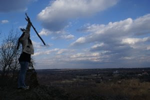

These photos are from a hike at Ramapo Reservation near my town in North Jersey, where I've lived my whole life.
Project 1 Assessment
Project 1 was a great experience for me. My images were meant to be my social commentary on a specific issue that is very near to me, but the fact that I involved my own children in it made it even more fulfilling.
I learned a lot about my camera, composition and lighting in the first weeks of shooting, but I think there's a lot more to learn. If I could go back and redo this series, I would know to pay more attention to the way that I hold the camera.(Landscape/Portrait).
This project helped to prepare me for the upcoming projects by teaching me little things to keep in mind while shooting. Primarily, I have to ALWAYS check my camera settings!! I lost a lot of great photos because I didn't check the shutter settings. A whole day of shooting resulted in slightly blurred images.
I think I was able to convey a certain message, but I know that I can do it better given more time.
Response to: In, Around, and Afterthoughts-Martha Rosler
If you ask me, I think that Rosler’s article is written much like a documentary photographer would shoot a subject. In an article like this, the words are carefully chosen to frame it a certain way, thus encouraging the readers to be swayed into believing certain things. She sheds light on her perception of the manipulation of the photographer in early documentary photography while manipulating the reader in much the same way. She states that, “Any response to an image is inevitably rooted in social knowledge,” when referring to Dorothea Lange’s Migrant Mother. I disagree with her comment that “responses may be generated from not having any prior knowledge of certain social issues.” We have to assume that our audience that is viewing our images are well-educated, but Rosler is implying that we are dealing with an audience that has no choice but to believe everything that they see without any consideration to the construction of images.
Images that are constructed by the photographer usually serve to represent some bigger social issue than the singularity of one image. They are meant to raise awareness of certain social aspects that may be otherwise overlooked.
Rosler then goes on to comment on more modern documentary photography stating that Szarkowski makes a poor argument for the value of disengagement from a “social cause” and in favor of a connoisseurship of the tawdry (Rosler, p. 5). The viewer is not expected to define the photographer’s boundaries. They are privileged to witness their experiences and appreciate them for what the photographer appreciates.
It seems to me that the Bowery images serve to represent a changing environment. If it’s change was never documented, then how would future generations get any sense of what came before the present?
Sunday, March 23, 2008
Project 1 Analysis
I think that Project 1 for me was challenging but went pretty well. Not having taken many photography classes, I struggled a bit on my shots. I think that I got a good 3 pictures, but with more time they may have been able to turn out better. I think the composition and concept of all three pictures were strong but, the lighting could have been worked on more. Overall, I was pretty happy with my shots and am exciting to shoot for the next two projects. As a class, I think everyone did a great job for the first project.
Thursday, March 20, 2008
Assessment of assignment 1

Assessment of assignment 1
Nancy O’Reilly
3Me with the guys
Nancy O’Reilly
3Me with the guys
I feel my photo shoot of the Unofficial Veterans Meeting held at the local vacuum cleaner repair shop went well. The men were all very gracious in allowing me to photograph them at their meeting, which is really more of a weekly social event. There were several constraints which I was confronted with during the photo shoot. In a room that was approximately 25 x 20 feet there were about 40 or more people, the repair shop equipment, a large desk and cash register; not to mention the low ceilings and fluorescent lighting. Unfortunately, I had to shoot in auto mode, there was no place for a tripod and I needed the camera flash. I had never done anything like this before; going to a meeting in photographing a group of people is normally outside of my comfort zone. The experience of it all was very worth while and I have learned a lot about photographing in tight areas and trying to get people at ease with the camera and pretend I am not there. Trying to tell a story in only three pictures was also much more challenging than I anticipated. A lot of thought and time needs to go in to the selection process.
As far as the critique, I'm not sure how that went; it seemed to be 50-50 with two comments made one positive and one negative. I do agree it would have been more successful if I had printed in a much larger matte format. I do feel the three photographs I selected, when looked at closely; do give a sense of what was going on and who was there. Overall I feel my presentation was successful. –NJO--
Place Top 8

 I tried to add more pictures in order and they do not come out in order.
 I have lived in NJ all of my life. When people ask  me where I am from and I reply "NJ" I can not
  count how many times through the years I have heard: "Oh yea...what exit?" Even comedians use it as the brunt of their jokes. Everyone lives off an exit somewhere. NJ is far from perfect but it is not all smoke stacks and asphalt either. This is my NJ.


 me where I am from and I reply "NJ" I can not
  count how many times through the years I have heard: "Oh yea...what exit?" Even comedians use it as the brunt of their jokes. Everyone lives off an exit somewhere. NJ is far from perfect but it is not all smoke stacks and asphalt either. This is my NJ.


Monday, March 17, 2008
Formal Analysis of Project 1
When looking back on project one, I feel like I have only scraped the surface of my topic. I shot at two locations, but only connected with one of them. Thus, I feel like I could definitely expand upon the scope/subject matter of my series.
The exposure of the photographs was originally a bit light, especially the posters. This was probably due to the the overhead fluorescent lighting. So, I increased the contrast slightly on all of the photographs and played with levels in order to fix the intensity of the poster/picture of the woman.
The composition of the photos is based in the idea of giving the viewer a glimpse into the overall mood of the shop, as well as the people who inhabit it. I liked that I was able to capture small details....snow globes, shampoo bottles, decorations on shelves. Such little extras lent to the character and appeal of the shop itself.
Ultimately, my project morphed into an exploration of beauty - beauty within the eyes of society and beauty within the eyes of individuals, specifically women. I didn't initially enter the salon with the intention of focusing on beauty. The subject revealed itself to me through the exploration of space.
In, Around, and Afterthoughts
Rosier's assertions concerning the legitimacy and purity of documentary photography are somewhat disconcerting. Her thoughts on modern photography seem to contradict the entire practice of documentary, claiming that images are now being utilized moreso to please the photographer, rather than identify cause for social change. It can be said that both agendas still fall into the category of documentary; where documentarians of old sought reform, we presently seek to merely identify.
Throughout the entirety of the article, Rosier struggles to find the definitive characteristics of a documentary photograph. She cites a variety of ambiguous instances in the history of photography in which the viewing population has had difficulty determining the overall purpose of the photographer, from staged images to photographs with no "polemic apparent". Of course, it can be argued that these are indeed documents, but she also argues, knowingly or not, that any still image can be identified as a document. In addressing this, she also addresses the main struggle of the contemporary documentarian.
Throughout the entirety of the article, Rosier struggles to find the definitive characteristics of a documentary photograph. She cites a variety of ambiguous instances in the history of photography in which the viewing population has had difficulty determining the overall purpose of the photographer, from staged images to photographs with no "polemic apparent". Of course, it can be argued that these are indeed documents, but she also argues, knowingly or not, that any still image can be identified as a document. In addressing this, she also addresses the main struggle of the contemporary documentarian.
Response to Rosler
In, around, and afterthoughts (on documentary photography) by Martha Rosler
Martha Rosler’s piece on documentary photography was very critical of the documentarian albeit accepting of the inevitability of documentarians photographing everything in sight. Overall, I enjoyed the text, but I thought she was a little bit too critical on the practice.
One of Rosler’s contentions is that documentary photography is to some degree unnecessary or wrong; she states, speaking of the New York Times story featuring documentary-style images from Walker Evans, that the reader learns that “the poor are ashamed of having been exposed as poor, that the photos have been the source of festering shame. That the poor remain poorer than we are, for although they see their own rise in fortunes, their escape from desperate poverty, we Times readers understand that our relative distance has not been abridged; we are still doing much better than they.” (page 4)
However, Rosler includes the other side of this argument, which is Szarkowski’s quote that the documentary photographer’s “aim has not been to reform life, but to know it.” (page 5) Rosler comes back again criticizing Szarkowski’s allowance of moral separation from the subject (namely in the case of Vietnam War photographers)
Rosler’s other thought is that “[t]he credibility of the image as the explicit trace of the comprehensible in the living world has been whittled away,” as exemplified by the story of the staged picture by Erwitt. (page 4) Though she compliments his apparently evident photographic ability, she jabs at the fact that "[t]he man pedaled back and forth nearly 30 times till Erwitt achieved the ideal composition.
mikey smith
In, Around, and Afterthoughts
Martha Rosler focuses on the legitimacy of present day documentary photography. She compares contemporary photographs (that which are posed, manipulated or "camouflaged") to past photographs solely used for "artless" documentation. Rosler believes that photographs now are infected with the agenda of the photographer and are put to use by swaying the populations' beliefs towards the beliefs of the elite. "A new generation of photographers has directed the documentary approach toward more personal ends."
Rosler uses the example of "drunks" to expose the contemporary images are influencing the public in the "wrong" way. These images (according to her) put the blame on the subject (the "drunks") in order to keep the unemployment rate, as well as many other socio-political/economical standards, in check. These photographs make an example of the poor and unfortunate, and subtly pose a warning to the public. For these reasons documentary photography is not "real" and still has a long way to go before it can "cure" social injustices.
Rosler uses the example of "drunks" to expose the contemporary images are influencing the public in the "wrong" way. These images (according to her) put the blame on the subject (the "drunks") in order to keep the unemployment rate, as well as many other socio-political/economical standards, in check. These photographs make an example of the poor and unfortunate, and subtly pose a warning to the public. For these reasons documentary photography is not "real" and still has a long way to go before it can "cure" social injustices.
Monday, March 3, 2008
ICP visit

International Center of Photography (visit 3/1/08)
What I liked most about the ICP was the innovative manner in which the artists displayed their works and the concepts behind the display. On the first floor was an exhibit of Barbara Blooms work. The concepts of her individual displays were fascinating to me, probably because I would not have thought to display my work in such interesting ways with all the many layers in the meanings. My favorite was the one entitled “Songs” which was a presentation of sheet music on plane metal music stands that displayed small pictures, not notes, on the pages. The originality of all her displays impressed me and will be something I tuck away in my mind for future reference.
Hans-Peter Feldmann,
Born: Dusseldorf, Germany 1941
9/12 Front Page 2001
100 Newspapers
Dimensions Variable
The most powerful image(s) for me was an Installation: 9/12 Front Page 2001. Again, it was the thought process and concept behind the installation that intrigued me not just the specific image represented throughout. I read the artist statement first before I began to look at the walls of the installation. I started to choke up before I had even finished looking at the images on the first wall; I had two more walls to go. It was almost paralyzing to read over and over what the headlines were around the world. Some of the most powerful headlines were: USA today “US under attack"; Republic of Ireland "Horror in U.S. Leaves the World in Shock"; The Independent "Doomsday America"; The Wall Street Journal "Terror Assaults Stun U.S.".
The images on display were almost a repetitive pattern of the Twin Towers on fire in large color format. One of the few newspapers to choose to go with two smaller pictures was The Wall Street Journal. They chose one small picture of the twin towers on fire and another small picture of people fleeing the area in terror both images were in black and white. The walls of the installation room were painted black with the images in simple frames and displayed in three rows all the way around the room. By the time I reached the middle of the second wall I started to feel the sorrow I had that day. I recalled where I was and who I was with, how we stared glued to the images on the television and cried. I sat down for a while on the bench in the middle of the room; I composed myself by writing a few notes. I then continued and viewed the images staring at me on the third and final wall. I'm not sure what was more powerful the images, the words or the two combined; I believe it was in the combination.
How we see and remember events of the past are embedded as images in our brains, the images picked by the media. How the events of history are documented is how it is forever viewed. This installation had a very powerful effect on me and brought back the memories of that day. The installation had a very somber feel like a funeral and in the sense it was, a funeral of the past that resonated and defined the future.
It never would have occurred to me to use the front pages of newspapers as an instillation.
Sunday, March 2, 2008
Response for 3/3/08 class
In, around, and afterthoughts (on documentary photography)
Martha Rosler’s 1981 essay seems to be a severely pessimistic view of documentary photography and how it is used and ultimately viewed. She focuses on how images are groomed for viewing for use in a magazine or newspaper and the meaning is altered so to sway its true intent. The meaning, according to her, has not only gone to the wayside but the images are viewed and forgotten about by the masses (mainly by the wealthy).
According to Rosler the documentaries of the 1960’s had more substance and meaning (to correct a social wrong..) which has been replaced by the more contemporary Diane Arbus type who’s work (according to Rosler) seems to exploit the odd or the unusual persona. The media has also changed the persona of a sidewalk drunk into a more palatable substance abuse user, changing the terminology with an image can change the viewers interpretation as well.
Weather it is a digital print being altered through Photoshop or a documentary about the plight of some-whatary the meaning can be altered by the photographer, publisher the viewer or all three and that will not change with time.
I’m sure I have said it before but the world probably needs to ingest not just more fiber for well being but a little moral fiber as well.
In, Around, and Afterthoughts
In this article, Martha Rosler critiques pieces tracing the ways in which photography's aesthetic social practices fail or succeed in generating collectively meaningful work. She believes that Documentary photography does not necessarily exist yet and what does exist is set up scenes generated to be what people want to see, and what photographers can sell. In her opinion work that not only takes into account the political conditions within which it was produced and assumes social and political responsibility but also activates the viewer. She describes work in which existing urban photography's ability to continue documentary photography's historical work is questioned, and in, around, and afterthoughts. She believes that when photography can make change, that is when Documentary photography can truly be acknowledged.
Tuesday, February 26, 2008
Summary of "In, Around and Afterthoughts"
This article had multiple points to make, all relating back to criticisms of documentary photography. Basically, the author believes that true documentary photography has yet to be invented. She believes that documentary photography has yet to realize it's true calling: the ability to transcend, alter or change the negative aspects of society - ie, use art as a form of social activism. Instead, documentary photo has fallen into two categories: Liberal (past) and Explorative (present). Liberal seeks to evoke pity in viewers, inviting them to help those depicted. Explorative seeks to understand feelings of alienation within the scope of sexism, racism, urban decay and class conciousness. Neither categories reach documentary photography's real potential. It is only when one seeks to utilize photos as a means of fostering change that one understands the goal of documentary work.
Monday, February 25, 2008
Exhibition review

Nicholas Nixon's Patients is a series of black and white photographs of people who are seriously or terminally ill. They are 20 x 24 gelatin silver prints, mostly head on portraits, there are a few very tight shots of people's faces or heads, and one of a person's hand. It is an individual's work on a theme.
The picture that I'm choosing to formally discuss is one of a woman holding a crying baby:
The photograph shows a dark haired woman with a solemn neutral expression holding a crying child against her chest. The background is out of focus. Like the other images in the series, it is black and white.
I found this picture to be very intriguing for a couple of different reasons. One is that it is the most ambiguous of all the images presented. It's unclear if which one of the subjects is the one that is terminally or seriously ill. Second, their expressions are very different, but they convey and stem from essentially the same thing. The woman (who I assume is the mother of the child) has a very solemn neutral expression, and the child has a very anguished crying expression.
I enter the image through the mother's cheek. From there I move down to the baby's face. There is almost a line, going through the mother's chin horizontally that separates the picture into two equal halves. The top half is mirrored by the bottom half, the mother's neck mirroring the blurry background of the top half and the baby's face mirroring the mother's ear. The image as a whole almost seems to form a yin yang. The pain that both the subjects feel are expressed in different ways, the mother's dark eyes and the babies gaping mouth seem to reflect this with the deep blacks.


exhibition review

I visited Gallery 14 in Hopewell NJ. While there I decided to do my critique on the work of Rhoda Kassof-Isaac. At the time she was showing an exhibit called “Translations.” The photographs were not entirely cohesive. They were fluid by the pair or small bunch. It was immediately clear the pictures were depicting a far off land. This distinction was not due to any visible landmark; the pictures had an ethereal feel that looked unfamiliar.
All the photos were taken digitally. Each was altered to a different extent but all of the pictures had been manipulated with Photoshop. Luckily the women whom took the pictures was also the person working at the gallery. I was able to discuss with her many of the choices she made when it came to how much to rely on Photoshop. What was particularly intriguing was the variety in texture and effects that she created. Many of the photos were taken while in a moving car. After she used Photoshop many of her pictures felt more like water/pastel or even oil paintings.
There were no people in her pictures only landscapes and architecture. During our discussion she explained to me that her children have a house in Switzerland and many of the pictures seen in the exhibit were taken there. The space she showed in was very cozy and personal. Because there was other artist showing at the time viewers got a good feel for Rhoda Kassof-Isaac’s style. She likes to experiment.
Some of her pictures were unidentifiable. All of her images were in color. She printed about 10 inches by 14 inches. Some of her photos were physically scratched on the surface. From far away I thought the scratched pictures were extremely manipulated by the computer and amidst her other images they blended in. When I moved closer to these particular photographs the scores on the paper were visible. The actual surface was ripped down to the white. Rhoda described these pictures as experiments she thought were going to end up in the garbage. Instead they resulted in being a compelling addition to her show.
The photographs I viewed are part of a fine art photography only gallery. I thought this meant not documentary photography but soon after arriving at the gallery I realized documentary photography and fine art photography could be one in the same. Her work related to specific documentary concepts. All her photos were of a specific place. Switzerland for example is somewhere I have never been. The pictures that she took captured that location and aided my own perception of it.
The picture I am going to formally discuss was taken while in Switzerland. It depicts a couple red houses in an extremely green valley. It is very hazy and when I viewed it up close the pixels were overstated. It looks like she used Photoshop to enhance the saturation. The colors are vivid and contrast each other. As a whole the picture moves from dark to light starting at the bottom of the image. The bushes, which are one the bottom half of the picture and again through the upper half, create a pattern. The repetition of leafs makes the image have a rough textured quality. This roughness contrasts the soft, eerie, feel that the color creates. This was the most ethereal of all her photographs.
I was drawn to this picture because of the colors. It seemed like a dream place. Somewhere you can only imagine. If you really did exist in that place the colors would stay the say and the houses would always be that red. Out of the entire exhibit this picture made me think the most. I wondered, “how much are tickets to Switzerland.”
Exhibition Review: The International Center of Photography

This two-story collection of works by various artists, though relatively small, provided great insight into the many practices and purposes of photography. With exhibitions displaying styles including portraiture, archival photographs, and short film, the International Center of Photography did well to give the visitor a good sense of the importance and value of the photograph, be that importance historic or intrinsic.
The first collection I encountered upon entering the museum was that of Barbara Bloom. I felt her work dealt primarily with the concept of materialism, having various photographs being presented with accompanying objects of furniture. This, for me, provided an interesting perspective on her imagery, for seldom does a viewer have a tangible reference with which to view and analyze a photographers’ work. I found the method by which she chose to display her underlying theme both interesting and innovative.
Heading down the stairs past the Bloom showing led me to the “Archive Fever” exhibition, which explored the uses of the document in contemporary art. Portions of this exhibition weighed heavily on history, particularly war and its effect on the individual. Parts of this exhibition were simply difficult to look at, as some photographs did very well in their presentation of the individual consequence of what would normally be perceived as national tragedy. In this respect, I found the work of Fazal Sheikh to be incredibly captivating. His series of images presenting outstretched hands holding images of loved ones really epitomized the terrible feelings of loss and isolation that are experienced by those who suffer from the horrible outcomes of war.
My visit to the International Center of Photography left me with somewhat of a greater appreciation for the medium of photography and its ability to capture and convey both emotion and time in such a profound manner that other mediums fail to deliver.


Subscribe to:
Posts (Atom)